Latinas in Tech
RESEARCH • UX • BRAND • UI
Background
Latinas in Tech is a non-profit organization that works to help make sure Latinas are well-represented in all levels of the tech industry. Their mission is to provide resources and opportunities within communities of each chapter that Latinas need in order to be leaders in tech. They began in 2014 and are founded by an entirely woman led organization with diverse backgrounds.
LiT already has a great website setup for users to learn about the organization and help contribute to their cause, however their member dashboard does lack a cohesive flow for members to access the different sections easily in one area.
ROLE
UX/UI Designer, UX Researcher
TIMELINE
May - June 2022
TOOLS
Figma, Whimsical, Photoshop
Discovery & Research
PROBLEM
LiT already has a great website setup for users to learn about the organization and help contribute to their cause, however their member dashboard does lack a cohesive flow for members to access the different sections easily in one area.
SOLUTION
I wanted to create a dashboard with all the actions clearly laid out in order to make it easier for members to access resources, create/edit their profile, and view the job board. An easier flow takes away unnecessary frustrations for members to get information and resources needed to gain employment or make connections. So I began my research process to see what I would need for a successful redesign.
Gather insights about the needs/process of searching for specific job roles
Determine what the direct/indirect competitors strengths and weaknesses are in their dashboard UI to figure out how to improve LiT’s design
COMPETITOR ANALYSIS
The main focus of the redesign was for the dashboard and job board so I looked to popular job sites as the other competitors for design inspiration. There are a good amount of job resource websites on the internet, but not many specifically cater to helping Latinx/Hispanic users in the US. The direct competitors I came across had strengths that LiT could benefit from incorporating such as responsive design and transparency for companies actively working with ICE which could be a moral issue for the Latinx users searching for employment.
USER INTERVIEWS
I set up interviews with 4 participants, 2 who were familiar with the LiT site and 2 who weren’t so that I could get specific insight from each group about their needs and pain points.
During the interviews, I had each of the participants explore the different sections of the LiT site and hear their impressions while I monitored. Through the interview results, I was able to determine the most common pain points amongst users.
Lack of profile view from dashboard
Dashboard design is too bare and offers no appeal to use since options are frustrating to access
Certain menu options are visible but not accessible
USER PERSONAS
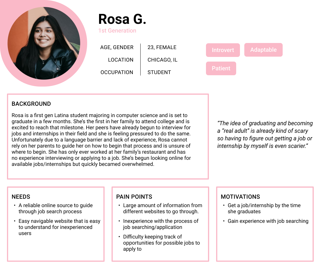
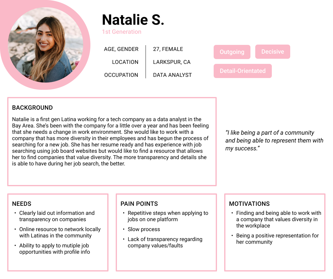
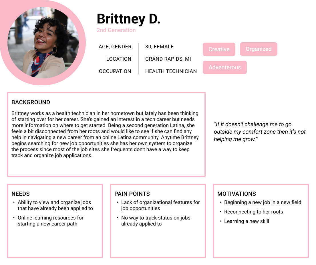
Using the data I gathered during the interviews, I created three personas with different backgrounds but with similar needs. I chose the Natalie persona to build my user flow around since her background included a tech job and I would be able to show a flow of someone already experienced with navigation a job site.
Redesigning the Website
LiT SITEMAP
Once the interviews were finished, I mapped out the current LiT sitemap that is shown to members once they have signed in to the site, in order to see where to add new features or pages and where they fit best. The current layout had most of the content nestled in the LiT Recruit and MyLiT pages and the dashboard wasn’t immediately available even after signing in. Users needed to access it from the navigation and when clicked, the dashboard homepage only consisted of a video about the organization and a link to the Job Board page, rendering it almost useless as a resource for members.
PRODUCT REQUIREMENTS
After mapping out the current sitemap, I took the findings from the user interviews and competitive research to create product requirements for each section of the website though the focus would mainly be on the:
Homepage
Dashboard
Profile
Job Board
My Jobs
SITEMAP REDESIGN
Taking the product requirements and previous sitemap, I created a new sitemap with the changes I planned to implement. I didn’t fully map out the content for the Inbox, Resources, and Meet Latina pages since I had a timeline to work by and they weren’t needed for the flows I would be testing. These pages could be built at a later phase of the project.
The biggest change made was moving over half of the content from the original homepage and turning it into sections of the dashboard homepage for the users to easily see. The other half stayed in the navigation though the rest of the navigation was updated to include new features to be more useful for members:
Inbox
Job Board
My Jobs
Language Selection
Profile
Flow
USER FLOW: TASK 1
After creating the new sitemap, I wrote out two tasks to have my persona test out which key screens would be necessary for successfully applying to a job and creating an account to give an impression on the new dashboard. The first task focused on the Natalie persona discovering the LiT website and then creating an account to take advantage of the job resources it offered while also setting up her profile.
USER FLOW: TASK 2
The second task focused on Natalie searching for a relevant job opening and then applying to the position while applying any necessary filters to narrow down her search. There would be a mini job wizard that is optional for users to complete to ‘Quick Apply’ to a job listing if they chose not to navigate to the company’s website to apply to the job directly. I wanted to be sure to include this feature after hearing the interview participants note a common pain point of applying to jobs was the repetitive process for each listing. A ‘Quick Apply’ option allowed users to apply to more jobs in a shorter time frame.
Wireframes
FIGMA SKETCHES
The wireframe ‘sketches’ were created in Figma for the homepage, creating an account, dashboard, job board, and the job wizard to quick apply to a job. All the information gathered from the research phase and my updated sitemap helped in solidifying the designs created.
Branding & Design
REBRANDING LATINAS IN TECH
While the current color palette for LiT has its own charm, I wanted to rebrand and step away from the soft pink. I decided to choose a color palette that spoke more to the Hispanic portion of the brand, so I settled on a a bold orange with a slightly dusky yellow to illustrate the warmth associated with the culture while simultaneously representing the warmth shown by members of the LiT community.
HOMEPAGE REDESIGN
I decided to redesign multiple sections of the LiT site, starting with the Homepage. Latinas in Tech has a pretty simple landing page that doesn’t hold a lot of information for first-time users to sift through.
During my interviews, the two users who weren’t familiar with LiT pointed out that the lack of information about the organization didn’t give them full confidence in its authenticity. So I included a section for users to be introduced to the Founders of the organization and a testimonial section of users who had become active members to give first-time users a better sense of security.
RESPONSIVE UI
Making the dashboard responsive for mobile was the most challenging due to all the sections. I ended up removing the name card with the member photo and leaving the more informative sections to avoid making the space feel too cluttered. The job board was simplified by using a filter icon to hide all the filter options that users could tap whenever they need them.
ACCOUNT/SIGN UP
The current sign-up process is simple and straightforward, a pretty basic form field. I expanded on the design to include creating a simple resume that would be viewable from the user profile as well as an option for users to upload portfolio pieces that would also appear in the profile. Implementing this change made it easier for inexperienced users to have the opportunity to present some form of a resume if they don’t have a polished one ready to upload.
The portfolio image upload section gives users a chance to showcase some of their work to members within their chapter and the company for any potential job outreach.
DASHBOARD
Once a user is signed in, I wanted the Dashboard to be the central hub for the user. A place where they could access every resource they needed. I split everything that was in the main navigation of the site, before signing in, to the Dashboard so the user could still access the resources while gaining new navigation.
The new layout allowed the user to see some things that would have been previously hidden in the navigation such as Monthly News and updates about their selected chapter. Users could now see job alerts relating to their field and access their profile from the Dashboard.
JOB BOARD
Other than the dashboard, the job board is where the user would spend a good amount of time. The current LiT job board has a great feature here called “perk badges” that give a highlight of what the role has to offer for users to see without reading the full details. I carried that over into my redesign but simplified the badges into icons so as not to take away too much attention to the text of the job listing cards. With my research knowledge and own experience from this site, I extended the filter options and added a ‘sort by’ feature for better usability in finding a specific role.
QUICK APPLY WIZARD
A common pain point for users while job hunting was the repetitive required task of inputting information from their resume and then needing to upload their resume afterward on most job sites. So, taking inspiration from Linkedin, I added a similar feature in my redesign for users to apply to multiple listings a day with the ‘Quick Apply’ wizard. However, I wanted users to have options so they can also choose to apply to the job posting directly from the original company website which would open in a new page once the button is clicked.
Prototype
TESTING
I created the prototype so that during testing, participants would be able to complete three tasks created with my chosen persona in mind:
Create an account from the homepage.
Use the account wizard to get a profile all set up.
Apply to a job listing using the Job Board.
View the final prototype with changes implemented after user testing.
Iterations
REVISIONS
The usability test was well received and only a few minor changes were chosen to be made for each section, all mainly due to padding issues. The participants were all able to complete the tasks given to them with some hitting a snag during the uploading a picture section of the account wizard:
I tweaked the design for the testimonial section to include another illustration
For the users that hit a snag in the account wizard section, I included an icon image for clarity and wrote out clearer instruction in the tip section.
In the Dashboard and Job Board, I gave more padding in areas that felt too cluttered/overpowering so first time users would not be overwhelmed and stop their exploration of the site.
NEXT STEPS
The time spent in the research phase greatly contributed to my usability test resulting in minor iterations. With a second round of testing, I’d be interested to see if the results are the same and the design is solid enough to flush out the rest of the website. It would also be interesting to see how well the redesign would be received by the designers of LiT and if it would inspire any changes.


